ShiftForce Scheduler
Optimizing shift scheduling for efficiency and clarity
Role:
Industry:
Tools:
Sole UX/UI designer
Workforce management/Scheduling software
Figma, FigJam
TLDR;
The Product
ShiftForce is a workforce management platform. This study focuses on redesigning the scheduler feature to improve usability, efficiency, and clarity.
Users
Mike — a busy manager who spends a significant amount of time scheduling employees and needs a clear, efficient, and intuitive scheduling tool.
Emily — a tech-savvy employee who logs in briefly to check her schedule, request time off, and get shift updates.
Scroll to Section
The Problem
The existing scheduler was cluttered, confusing, and inefficient, with a cumbersome drag and drop method, scattered actions, poor UI structure, cognitive overload, and lack of intuitive navigation.
Goal
Redesign the scheduler to streamline shift creation, improve clarity and usability, enhance efficiency, and improve the employee experience.
Scroll to Section
Research
Conducted an internal audit of ShiftForce's current scheduling flow, identifying areas of friction and opportunities for improvement.
Analyzed competitor platforms to understand best practices for scheduling UI and interaction design.
Focused on answering a few key questions.
Scroll to Section
Proposed Solutions
Removed drag and drop scheduling and introduced a click to create workflow for faster shift creation.
Restructured UI elements, grouping key actions together for better usability.
Simplified the interface by nesting related features, reducing cognitive overload.
Ensured key scheduling tools were always accessible, improving navigation and efficiency.
Scroll to Section
Final Design
Scheduling became faster and more intuitive, allowing managers to assign shifts with fewer steps.
Improved usability and adoption, reducing frustration for both managers and employees.
Better alignment with ShiftForce's goal of being a simpler, smarter workforce management tool.
Scroll to Section
Introduction;
This project focuses on the redesign of ShiftForce's scheduling feature, a core functionality of the platform. Over time, the scheduler became cluttered and unintuitive, with disorganized UI, inconsistent feature additions, and cognitive overload for users. The goal of this redesign was to create a more intuitive, visually clear, and efficient scheduling experience, improving usability for both managers (who handle scheduling) and employees (who need easy access to their shifts).
ShiftForce is a workforce management platform designed for industries like restaurants, hospitality, and retail to streamline employee scheduling, communication, and operations. Businesses use it to schedule shifts, manage time-off requests, track daily profit and loss (via POS integration), create tasks and events, and communicate with staff — all within a single system.

Persona 1: Manager Matt
Age: 40-55
Job Role: Restaurant/hospitality manager, shift supervisor, or franchise owner
Tech Comfort: Varies - somewhat tech-savvy but prefers straightforward, no-friction tools
Usage Pattern: Uses the platform daily for scheduling, time-off approvals, and staff communication
Matt wants to be able to quickly create, adjust, and publish employee schedules with minimal friction, ensuring all shifts are properly covered while avoiding conflicts.
Pain Points:
Cluttered UI makes scheduling tedious — too many buttons/options that weren't thoughtfully integrated
Cognitive overload — hard to find key features among unnecessary complexity
Inefficient scheduling process — wants to quickly assign shifts but gets slowed down by outdated design
Communication friction — needs to message staff about shift changes but the system isn't intuitive
Needs from the Scheduler:
A clear, structured UI that eliminates clutter and makes scheduling faster
Intuitive shift creation and editing — fewer clicks, less friction
Seamless integration with time-off requests so he can avoid conflicts
Easy-to-use messaging tools to notify employees of changes instantly

Persona 2: Employee Emily
Age: 18-30
Job Role: Server, bartender, cashier, front desk associate, retail worker
Tech Comfort: High - very tech-savvy, familiar with mobile apps
Usage Pattern: Quick, task-based interactions — logs in only when necessary to check schedule, request time off, or communicate with managers
Emily wants to instantly view and understand her upcoming schedule, request time off easily, and stay informed about any shift changes.
Pain Points:
Difficult to find her schedule — wants an instant overview, not extra steps
Confusing time-off request process — unsure if requests were submitted or approved
Lack of clarity in shift changes — misses updates because notifications aren't clear
Overcomplicated interface — doesn't want to "learn" the app, just needs it to work
Needs from the Scheduler:
Simple schedule view — fast, clear, and easy to check at a glance
One-tap time-off request submission with clear confirmation/status update
Instant notifications for shift changes so she's always aware of updates
Effortless messaging — needs a fast way to communicate with managers without digging through menus
The Problem
ShiftForce's scheduler feature is a critical tool for managers and employees, but its outdated UI and fragmented additions have made it cluttered, confusing, and inefficient.
For managers, scheduling is a daily task, but the clunky interface and overwhelming number of options make it harder than necessary to create and adjust schedules efficiently.
For employees, the experience is equally frustrating — viewing shifts, requesting time off, and getting schedule updates should be seamless, yet the existing design buries essential actions behind a confusing UI, leading to missed updates and unnecessary friction.
Without a more streamlined, intuitive, and visually clear scheduling system, ShiftForce risks frustrating both key user groups, reducing platform efficiency, and increasing operational headaches for businesses.
Hypothesis
We believe that by redesigning the scheduler to be more structured, visually clear, and user-friendly, we can:
Increase scheduling efficiency for managers by reducing cognitive overload and simplifying shift creation
Improve employee experience by making schedules easier to access and shift updates more transparent
Reduce confusion and frustration by making ShiftForce a more enjoyable, time-saving tool for both managers and employees
To begin the ShiftForce scheduler redesign, I conducted a deep dive into both our existing scheduling flow and competitor platforms, focusing on how scheduling features are structured, how interactions are handled, and where usability improvements could be made.
I first reviewed our current scheduler to break down the full user flow for creating and managing schedules. I mapped out all existing interactions within the scheduler page and identified several pain points where the process felt unnecessarily complex or unintuitive. My primary focus was to answer:
Where are users experiencing friction?
What parts of the interface are overwhelming or unclear?
How can we make scheduling more intuitive while reducing cognitive load?
Competitive Analysis
I conducted a comparative analysis of similar workforce scheduling tools including 7Shifrs, Homebase, Deputy, HotSchedules, and WhenIWork. I focused specifically on how competitors structure their scheduling layout, what interactions they prioritize, how they handle nesting and hierarchy to improve clarity, where we fell behind in terms of usability.
This helped me highlight best practices we could learn from and apply while also surfacing unique opportunities for ShiftForce to improve upon existing industry standards.
Three primary areas for improvement:
1 - Reducing complexity and cognitive load
2 - Improving layout and interaction design
3 - Enhancing scheduling clarity
Proposed Solutions;
Based on my research findings, I focused on simplifying interactions, improving clarity, and reducing unnecessary steps to make the scheduler more intuitive and efficient.
Eliminating Inefficient Drag and Drop Scheduling
One of the biggest usability issues I uncovered was the we were the only scheduling tool still relying on drag and drop to assign shifts. While this may have seemed like a convenient feature, it actually made the process more cumbersome — requiring multiple actions to complete a single shift assignment:
1 - Drag shift onto calendar
2 - Click on it to open the editor
3 - Manually assign it to a position or employee
This did not save time or reduce friction, making it a counterproductive interaction.
I presented these findings to internal stakeholders, explaining that drag and drop was not helping our users and was adding unnecessary complexity. I proposed an alternative: Click to create shifts. Instead of dragging, users could simply click in a specific row (representing a position or employee) and column (representing a date). This would instantly generate a new shift entry and open the shift editor, making scheduling faster and more intuitive.
After presenting my case, I gained stakeholder approval to move forward with this new scheduling flow.
Restructuring Actions for Better Usability
Another major issue was that key scheduling actions were scattered across the interface, making it difficult for users to find what they needed.
To improve usability, I:
✅ Grouped related actions together instead of spreading them across the page
✅ Nested features logically to reduce clutter while keeping them easily accessible
✅ Ensured that common actions like adding shifts, approving time off, and making edits were clearly visible and quick to access
Designing A More Efficient Scheduling Experience
With these improvements, the new scheduler was designed to:
✅ Speed up shift creation with a simple click to create workflow instead of cumbersome drag and drop
✅ Improve clarity by organizing actions into logical groups and reducing UI clutter
✅ Make navigation easier by ensuring important scheduling tools were always accessible
✅ Enhance overall usability by aligning the design with b
Final Design;
The redesigned scheduler transformed a cluttered, unintuitive experience into a streamlined, efficient, and easy to use scheduling tool for both managers and employees. By eliminating drag and drop scheduling in favor of a faster click to create workflow, restructuring key actions, and improving layout clarity, the new design significantly reduced friction in the scheduling process.
Key improvements in the final design:
Click to create scheduling — users could now simply click in a row and column to create a shift, instead of dragging and then manually assigning it.
Better action grouping — consolidated scattered buttons and controls, making important actions easier to find and use.
Cleaner, more organized UI — reduced visual clutter by nesting related features and presenting information in a more scannable way.
Improved navigation and accessibility — ensured that scheduling tools were intuitive, predictable, and always accessible when needed.
This design supports ShiftForce's goals of being a comprehensive yet easy to use workforce management tool by making scheduling more efficient, improving usability, enhancing employee engagement, and aligning with industry best practices.
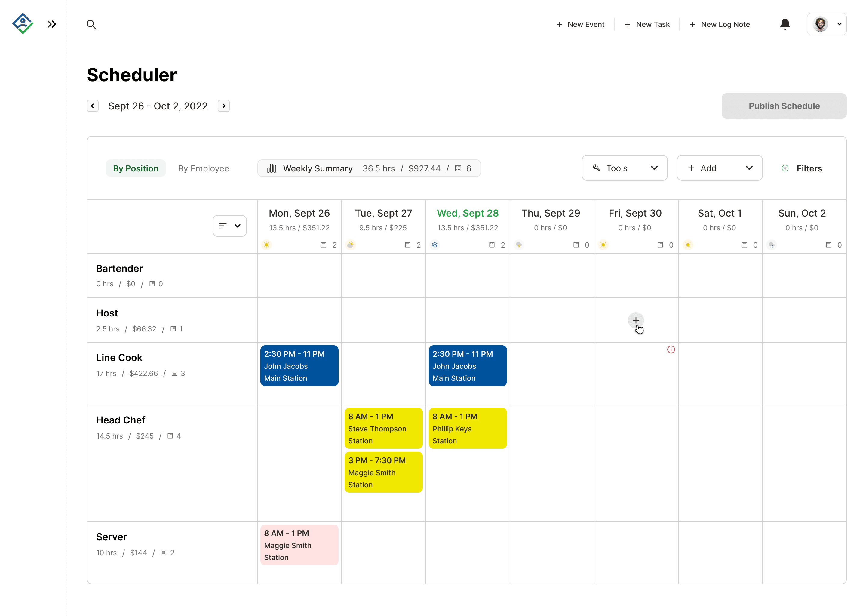
Viewing by position

Viewing by employee

Viewing by employee along with employee status'/conflicts.
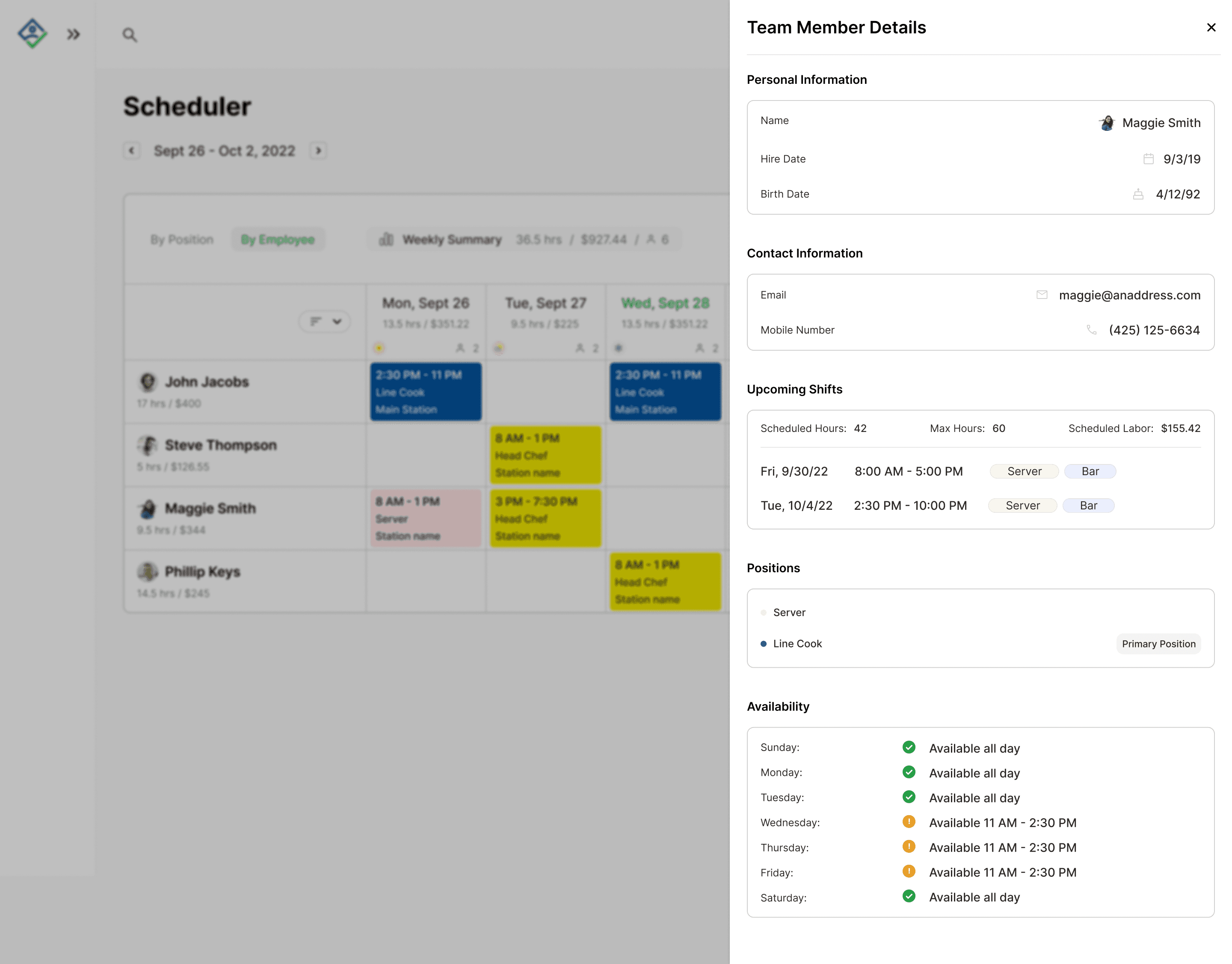
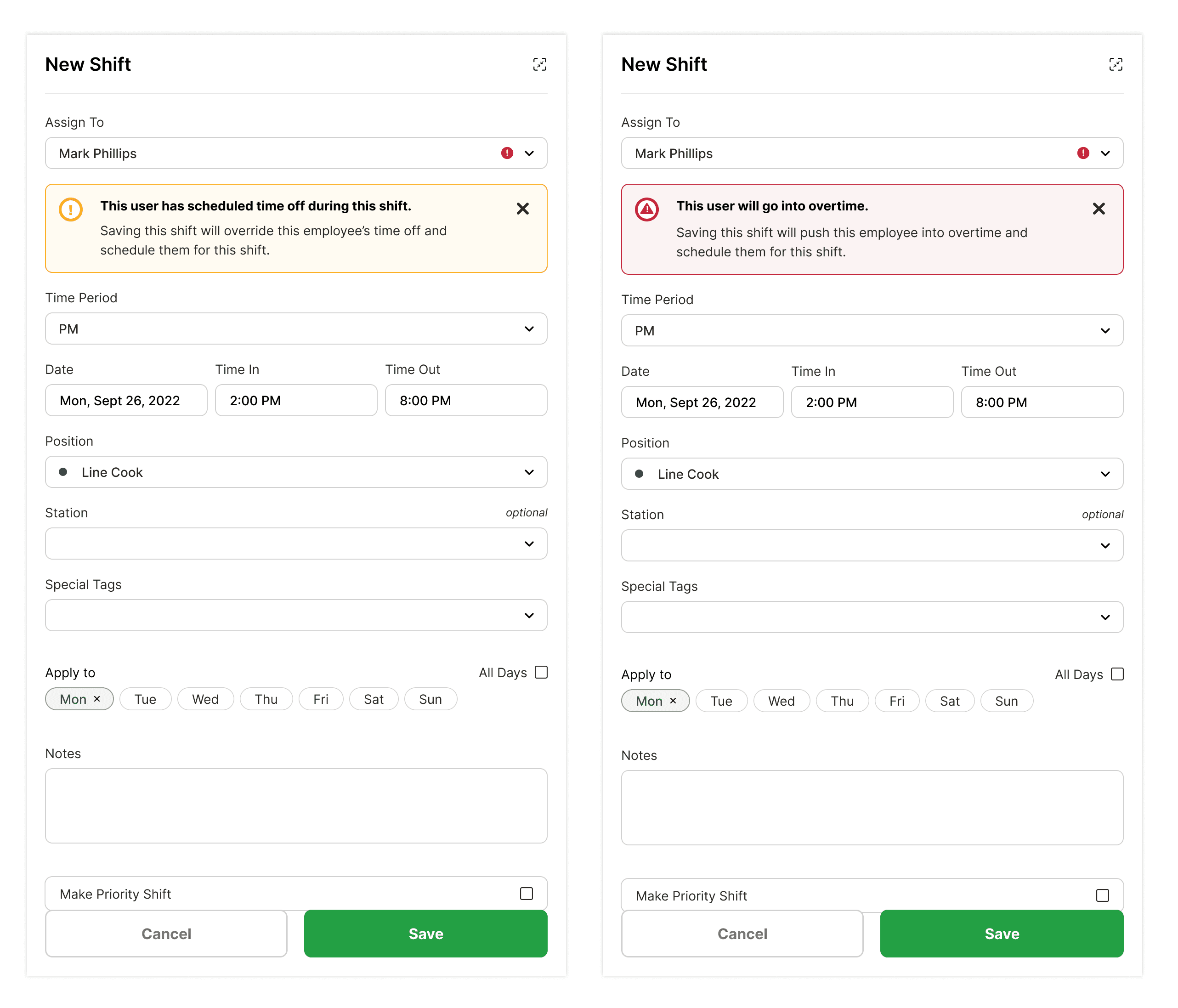
Drawer viewing a specific team member's details.
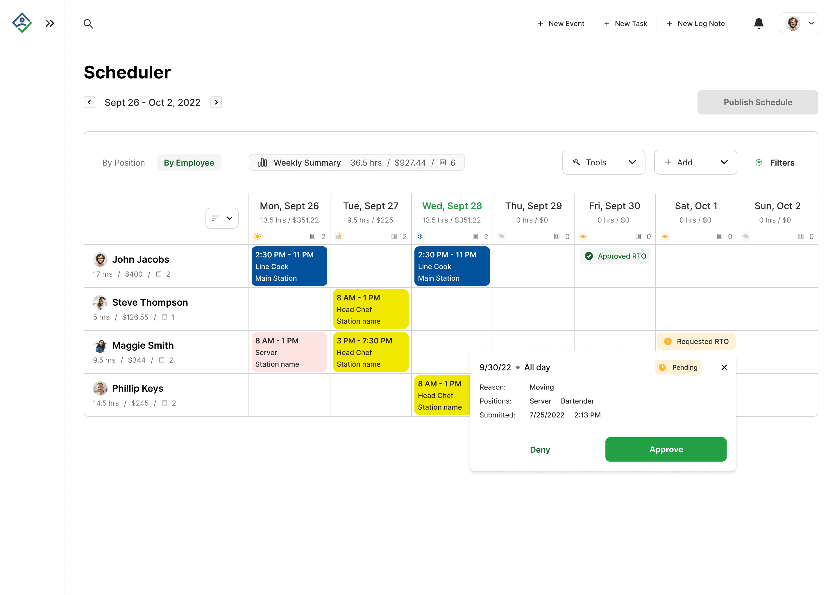
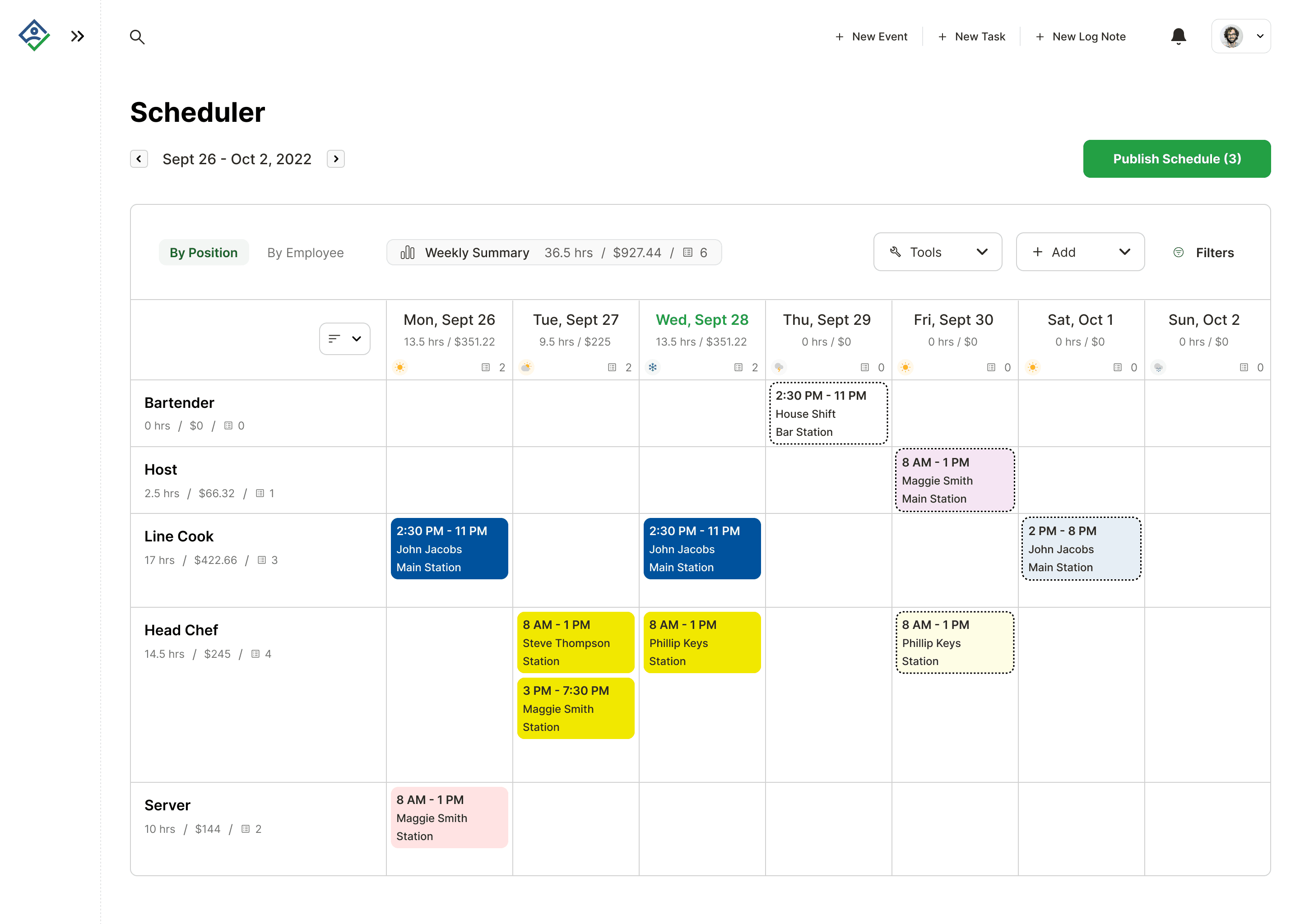
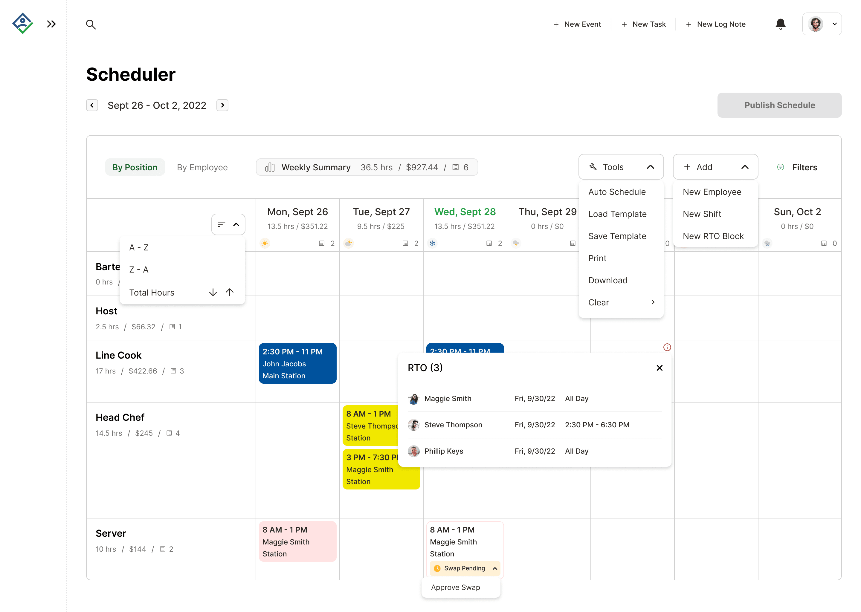
Ability to approve/deny time off requests right on schedule.
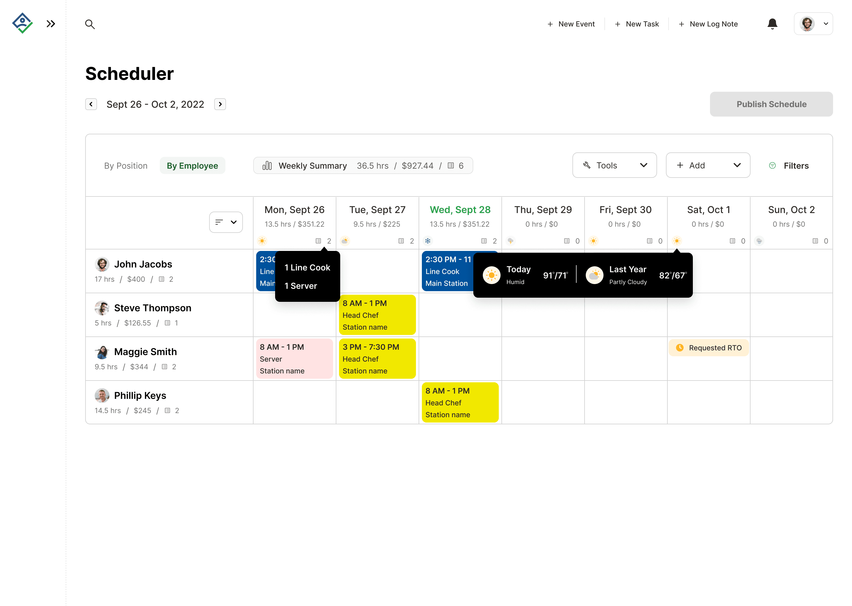
Some hover states detailing more information to manager.
Check Out Oply's Onboarding